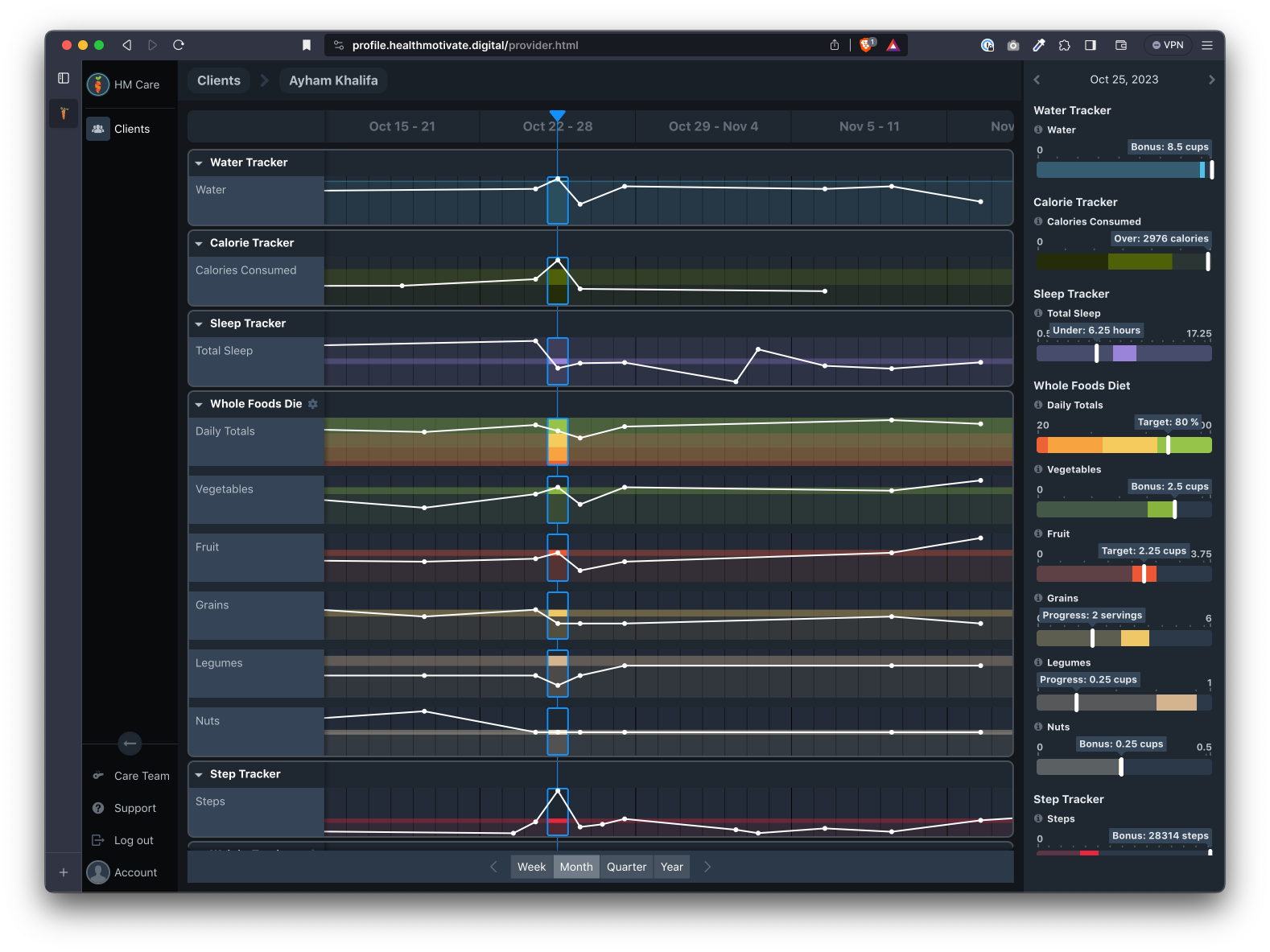
Data Inspector
The data inspector, located on the right panel, zooms into the selected sample period and metrics in the Tracks region to give more detail to the meas
Last updated: May 7, 2026
The data inspector, located on the right panel, zooms into the selected sample period and metrics in the Tracks region to give more detail to the measurements in the selected sample. Think of it as a magnifying glass to the data shown in the Tracks region.
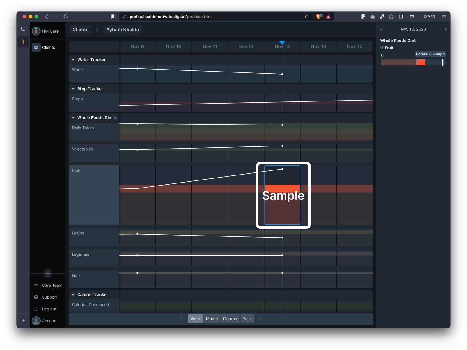
Data Samples
Each track is a horizontal row of samples. Each sample is either an individual recorded event or a collection of events that have been aggregated as one sample.
Selecting an individual sample will show its detailed information in the inspector.
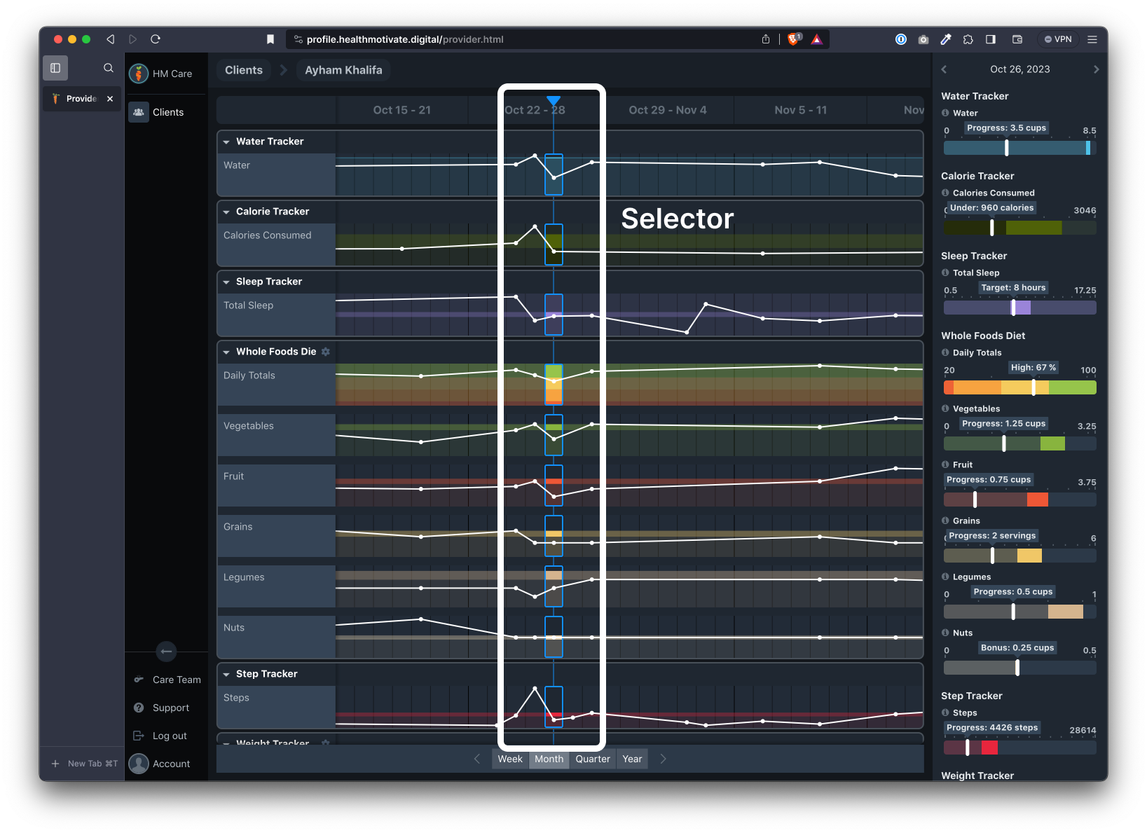
Selector bar
The selector bar allows you to select the column of samples you wish to inspect in greater detail.
Metric charts
The inspector currently displays each metric value as a bar chart. The current value is identified by a white bar along the chart.
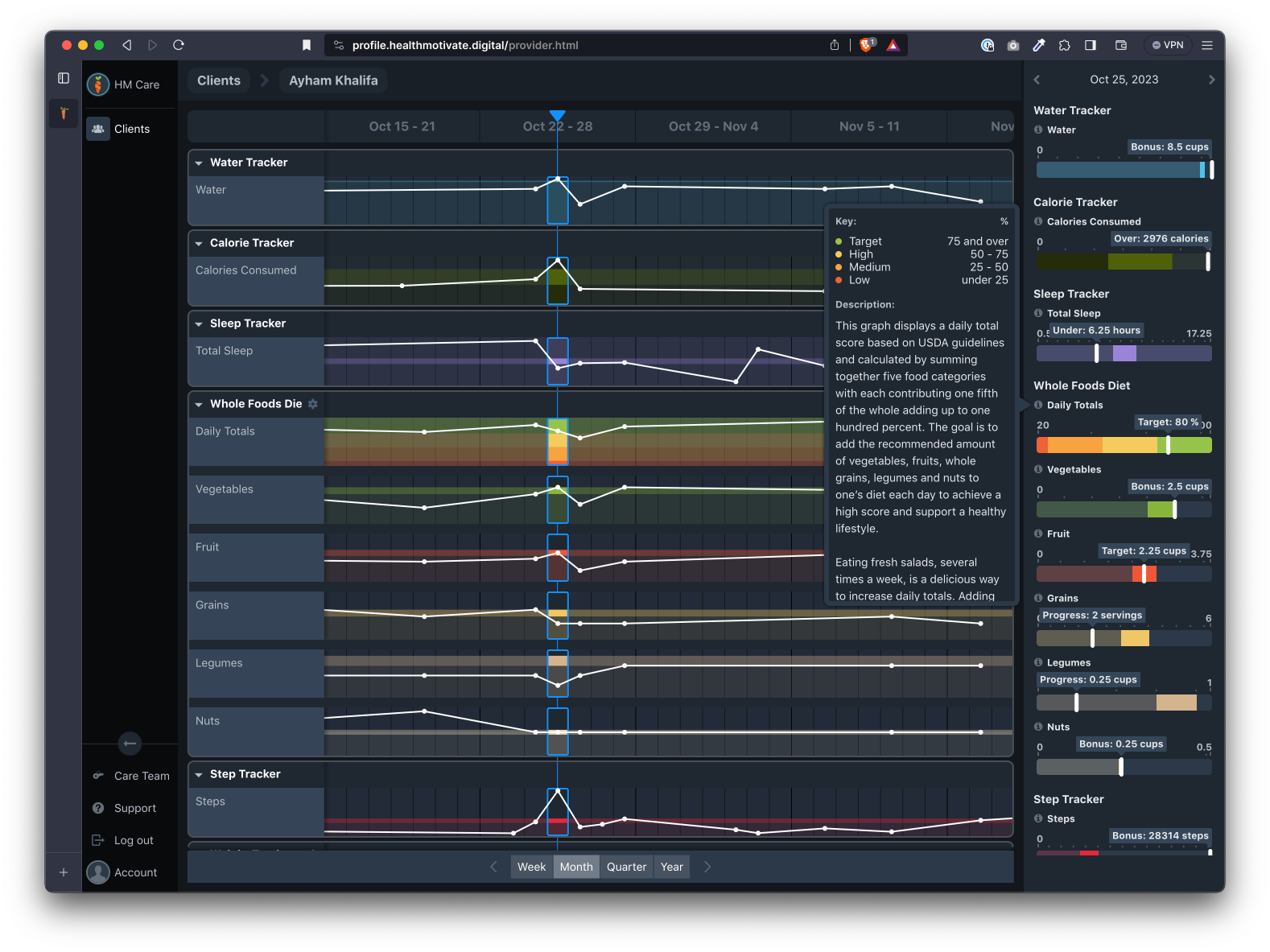
Metric chart key
The metric chart key is accessed by clicking the question mark on the left side of each metric. This key explains how the metric values are plotted on the chart.
Hovering over each chart displays information about each range (the color coded sections of each chart). Ranges are defined in each plan or tracker.
Time navigation
The top of the data inspector displays the timeframe for each inspected metric. Note that you can advance forward or back by one unit of time using the arrows to the left and right of the time.
Was this article helpful?