Trend card
The trend card shows your progress in a wellness activity over time using a color-coded horizontal chart.
Last updated: May 7, 2026
Trend card
Purpose
The trend card is designed to show your progress in an activity over time. Each trend card contains one or more horizontal rows of colors that inform you of your status when an activity was recorded. The timeframe can be changed to show more or less activity history at a time. And some charts allow you to switch between multiple metrics for comparison.
Usage
Each wellness activity you choose to track includes a trend card to give you a view of your progress over time. To access the chart, choose an activity in your dashboard, then choose to "View trends." Usually this will be shown immediately as an action button at the bottom of the screen, but sometimes it will present the option after logging an activity.
Reading the chart
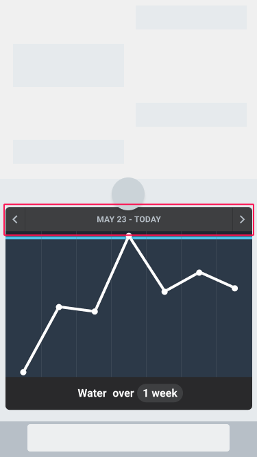
Time range
The top of the chart displays the time range of dates or times. To view older or newer dates, tap the left or right arrows beside the date. (If you are already at the most recent date, the chart will not advance forward into the future.)
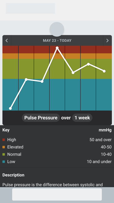
Horizontal Colors
The horizontal rows of colors are defined by the metric you are tracking. They may present ranges of values that identify the target value, or the ranges may simply tell you degrees of concern about your progress. A color may be a single value or a range of values.
For example, if you are tracking your hydration, you may set your target to be 8 cups of water. This would display a single value color.
But you may also apply a target range, such as 7 to 9 cups of water. If so, the chart would display a color range.
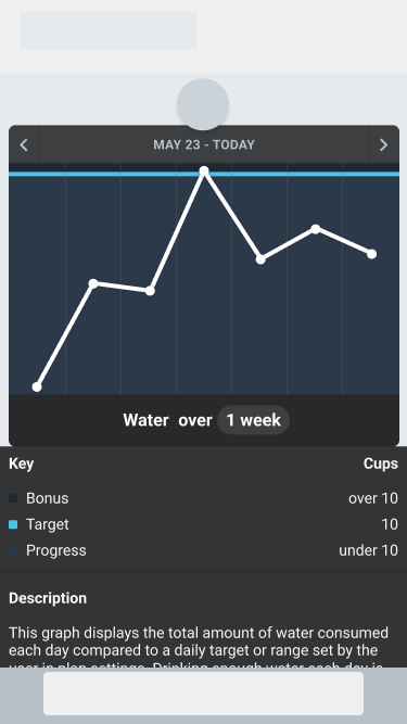
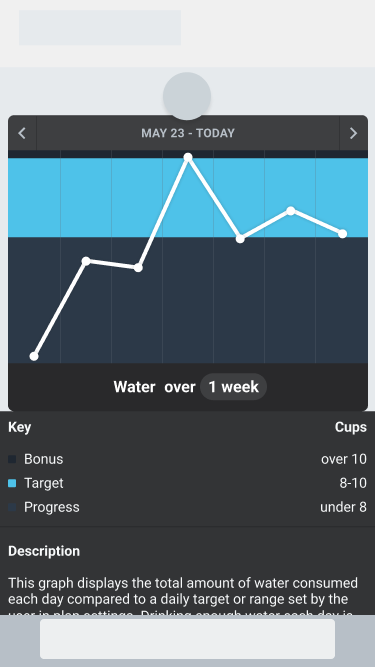
Chart key
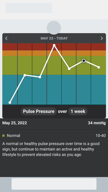
By default, the chart includes a chart key at the bottom to explain the meaning of each color. This is a list of colors, their corresponding description and their metric unit and values. For example, the chart below includes a key identifying the meaning of each color used in the "Pulse Pressure" metric of the hypertension trend card.
Sample detail
When a single plot is selected, the chart key is replaced by the sample details. These include:
- The date(s) of the selected plot
- The value and unit of the plot
- The color range identified by the plot value
- A description of the color range
Below is an example of a selected chart plot and its details.
Changing the chart view
Changing the timeframe
The chart title bar includes the timeframe of the chart. By default it is set to one week of activities. To change the timeframe, tap the timeframe in the title bar. When selected, a picker will appear allowing you to choose the desired timeframe range.
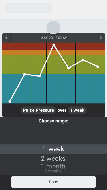
Tap the "Done" button to save the desired timeframe view.
Changing the metric
The chart title bar sometimes includes the metric shown in the chart. To change the metric, tap the metric name in the title bar. When selected, a picker will appear allowing you to choose a different metric.
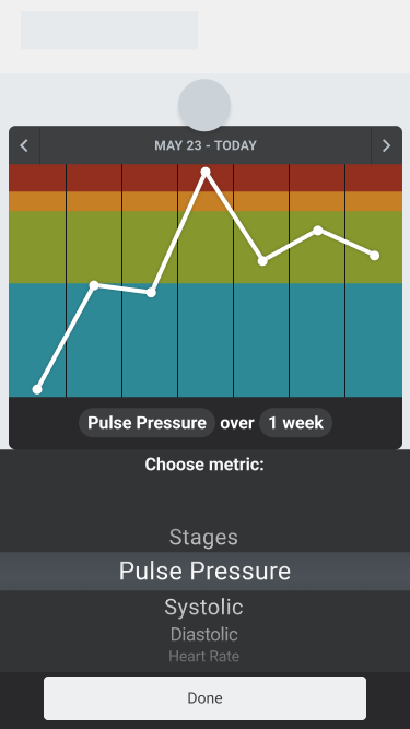
Tap the "Done" button to save the desired metric view.
Was this article helpful?